Recently, more and more often, clients come to us, feeling the need to improve the visual communication of their brand. Many questions arise, including those related to colors, which are supposed to, among other things, reflect the atmosphere and DNA of a given brand. Although many people initially claim that it is not difficult, they often change their minds later. How to choose the right palette? Which color will be the right one? What does color psychology have to say about it? How to achieve the intended goal with color? These are just some of the questions that arise. The basics of color are the first stage of the adventure of creating well-designed visual communication.
To understand how to choose the best color and achieve your goal with it, you must first master the basics of color, i.e. their classification and the terms used to describe them. This is just the beginning, but without this information, it will be hard to move on ;)
It is worth starting your brand color adventure by learning the three main attributes that describe colors. These are:
– colour (or shade),
- value,
– saturation.
Color Basics – Color and Color Temperature
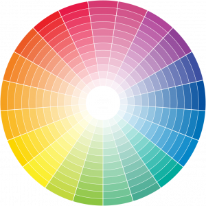
Hue refers to the essence of color, or shade. Of course, it's about how we name colors. Whether we call a given color blue, red, orange, yellow, green or purple. All colors are on the color wheel, of course :)

The concept of color is related to the term temperature. Each of us probably knows that colors can be divided into those that we define as cool and those that are warm. What is it about?
Let's start with a simple example. Which of the following colors do you consider cool and which are warm?

Most of you can probably easily identify the color temperature of orange as warm and blue as cool. Bravo! But what if we have two shades from the same color family next to each other? Which one is warmer and which one is cooler? How can we check this?

In the case of the above two shades of green, it's a bit more difficult, isn't it? How do we check the color temperature here? If we're in doubt, we can help ourselves by checking where our colors are on the color wheel.
The warmest color is orange, and the coldest is blue. When we want to determine the temperature of a given shade, we check where it is on the color wheel. The closer to orange, the warmer the color. The closer to blue, the cooler it is. A trained eye will also see these differences when two colors are placed next to each other.
This is where the concept of color relativism comes from. For example, turquoise combined with lemon yellow will always have a cold temperature. However, when combined with sapphire it will be much warmer due to the influence of the yellow pigment.

In summary, if you are wondering what value a color has, you should consider whether it is light or dark? So tone or value refers to the relative lightness or darkness of a color.

If you learn the basics of color at the beginning of your color adventure, it will certainly be easier for you to choose colors for your brand that are consistent with its DNA. Not every blue or red means the same thing. Color attributes, i.e. hue, value and saturation, show us subtle nuances that affect the associations associated with a given shade. And this is just the beginning of an amazing game with colors. I hope you like it enough to join this adventure!
If you are interested, follow our blog. I will develop this topic. Or if you need to discuss the colors of your brand's visual communication, let me know. I will be happy to help! :)
Want more? Read our other articles:
- What are marketing funnels and how can they help you get to the next level?
- Instagram Account Audit – Part 2
- A few words about what is worth considering before you start the design thinking process
- Instagram Account Audit – Part 1
- Written by: Agnieszka Untimely
- Posted on: Feb 2, 2021
- Tags: visual identification, Marketing, color theory

