Redesigning the online website of our client with an established brand was a very important and responsible task. “Twój Lekarz” has been creating a network of modern medical clinics in the Wrocław Agglomeration since 2003. Currently, the network includes 11 specialist clinics, and the “Twój Lekarz” brand is locally recognized and appreciated by many patients – the clinic’s neighbors. The brand’s clear message is addressed to them: “Twój Lekarz” – health care in the immediate vicinity, in the neighborhood.
Facing the challenge of completely redesigning an existing website, we wanted to build a coherent visual message translating into high usability (UX) of the website. Modernity, but not "corporate character" - after all, the brand operates locally among the local community of communes where the network of clinics is located.
I will try to present the analytical and creative process that we used to redesign our client's website, so that it would meet the tasks set for it. A well-functioning website that is tailored to a given brand is not only beautiful graphics and a layout dripping with animations, but also a tool that supports the company's operations and the achievement of its business goals.
Let's get started.
Main goals of the Website redesign
Our client expected a redesign of the layout of his entire website and the possibility of editing it on your own. It was to become more readable, also on mobile devices, and also to be a user-friendly knowledge base aimed at patients.
The entire information architecture needed to be rebuilt to efficiently support three basic streams of people visiting the site with a specific intent:
- current patients
- future patients
- doctors on their career path
On the other hand, the website was also supposed to become a background for information activities in the digital environment; in social media channels and in paid advertising channels. In a word, the website should help build brand credibility, thus supporting marketing activities.
Website Redesign – Facts, Not Myths
As part of the redesign of the “Twój Lekarz” brand website, we designed 74 subpages, including the home page and a specialized page for ordering electronic prescriptions, which was to become an important element supporting the work of the clinic during the upcoming pandemic.
During critical moments of lockdown, the e-prescription ordering website relieved the clinic’s switchboard by providing the ability to order e-prescriptions 24 hours a day, freeing up the ability for people in urgent need to call the clinic.
Project Summary:
- 74 subpages designed
- Over 37 WordPress plugins analyzed
- Over 150 GB of data backups created
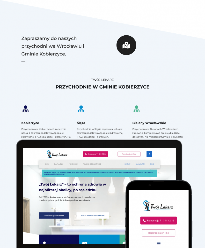
- Mobile version of the site created
- The ability to edit and manage the appearance of pages by the client is provided
- Adaptation of existing content (texts and graphics) to the new website
— Why did we analyze almost forty WordPress plugins?
WordPress is a CMS that powers over 20% websites on the world's internet. The popularity of WordPress stems from the fact that it is easy to expand the capabilities of this content management system with new functionalities using external plugins.
Unfortunately, many plugins are written carelessly and do not follow WordPress guidelines, which causes, at best, slower page loading and even worsens the security of the site. Our goal was to reduce the number of installed, unnecessary plugins. When checking plugins, we wanted to find answers to the following questions:
- Is the given plug-in updated frequently (abandoned plugins often become a backdoor for malware)?
- Is this plugin compatible with the latest version of WordPress?
- Does the plug do its job?
- Is the plug-in necessary for the website to function?
- Is the plug-in irreplaceable, e.g. by modifying the WordPress Child Theme?
If the answer to all of the above questions was “Yes”, then the plugin was eligible to be left. In doing so, we removed over 50% unnecessary plugins, which in most cases were a relic of previous site modifications by various creators.
The course of design works
Redesigning the online website of our client with an established brand was a very important and responsible task. “Twój Lekarz” has been creating a network of modern medical clinics in the Wrocław Agglomeration since 2003. Currently, the network includes 11 specialist clinics, and the “Twój Lekarz” brand is locally recognized and appreciated by many patients – the clinic’s neighbors. The brand’s clear message is addressed to them: “Twój Lekarz” – health care in the immediate vicinity, in the neighborhood.
Facing the challenge of completely redesigning an existing website, we wanted to build a coherent visual message translating into high usability (UX) of the website. Modernity, but not "corporate character" - after all, the brand operates locally among the local community of communes where the network of clinics is located.
I will try to present the analytical and creative process that we used to redesign our client's website, so that it would meet the tasks set for it. A well-functioning website that is tailored to a given brand is not only beautiful graphics and a layout dripping with animations, but also a tool that supports the company's operations and the achievement of its business goals.
Let's get started.
Main goals of the Website redesign
Our client expected a redesign of the layout of his entire website and the possibility of editing it on your own. It was to become more readable, also on mobile devices, and also to be a user-friendly knowledge base aimed at patients.
The entire information architecture needed to be rebuilt to efficiently support three basic streams of people visiting the site with a specific intent:
- current patients
- future patients
- doctors on their career path
On the other hand, the website was also supposed to become a background for information activities in the digital environment; in social media channels and in paid advertising channels. In a word, the website should help build brand credibility, thus supporting marketing activities.
Website Redesign – Facts, Not Myths
As part of the redesign of the “Twój Lekarz” brand website, we designed 74 subpages, including the home page and a specialized page for ordering electronic prescriptions, which was to become an important element supporting the work of the clinic during the upcoming pandemic.
During critical moments of lockdown, the e-prescription ordering website relieved the clinic’s switchboard by providing the ability to order e-prescriptions 24 hours a day, freeing up the ability for people in urgent need to call the clinic.
Project Summary:
- 74 subpages designed
- Over 37 WordPress plugins analyzed
- Over 150 GB of data backups created
- Mobile version of the site created
- The ability to edit and manage the appearance of pages by the client is provided
- Adaptation of existing content (texts and graphics) to the new website
— Why did we analyze almost forty WordPress plugins?
WordPress is a CMS that powers over 20% websites on the world's internet. The popularity of WordPress stems from the fact that it is easy to expand the capabilities of this content management system with new functionalities using external plugins.
Unfortunately, many plugins are written carelessly and do not follow WordPress guidelines, which causes, at best, slower page loading and even worsens the security of the site. Our goal was to reduce the number of installed, unnecessary plugins. When checking plugins, we wanted to find answers to the following questions:
- Is the given plug-in updated frequently (abandoned plugins often become a backdoor for malware)?
- Is this plugin compatible with the latest version of WordPress?
- Does the plug do its job?
- Is the plug-in necessary for the website to function?
- Is the plug-in irreplaceable, e.g. by modifying the WordPress Child Theme?
If the answer to all of the above questions was “Yes”, then the plugin was eligible to be left. In doing so, we removed over 50% unnecessary plugins, which in most cases were a relic of previous site modifications by various creators.
The course of design works
By maintaining a process approach, we knew exactly what stage we were at and were able to communicate effectively internally and with the client, meeting the deadlines for subsequent milestones. To manage the project, we used standard tools that we use every day, such as the Trello kanban board and the ASANA task manager/CRM.
The course of work was divided into four main stages:
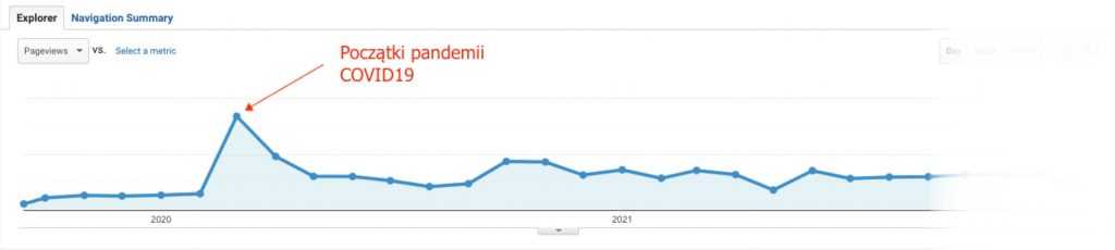
- Website audit with analysis of internet traffic data collected by Google Analytics.
- Development of mockups of the home page and subpages.
- Implementation of mockup designs.
- Launching the site on the client's server.
Audit of the website and its back-end
The audit of the redesigned website was conducted both from the user-visible side and from the back-end side. The audit consisted in analyzing the website in terms of usability (UX design) on mobile devices as well as on computers. Going through all the navigation elements of the site allowed us to prepare an effective navigation logic for the site.
Information on user behavior on subpages and their demographics was also collected and analyzed. Data on the operating systems used was also useful in consciously choosing design solutions for the new site.
As for backend, all plugins used have been analyzed in terms of their compatibility, security and functionality. The configuration of the hosting server was also verified.
Armed with the conclusions drawn from the post-audit data analysis, we began redesigning, or rather, designing, the client's website.
Development of page mockups
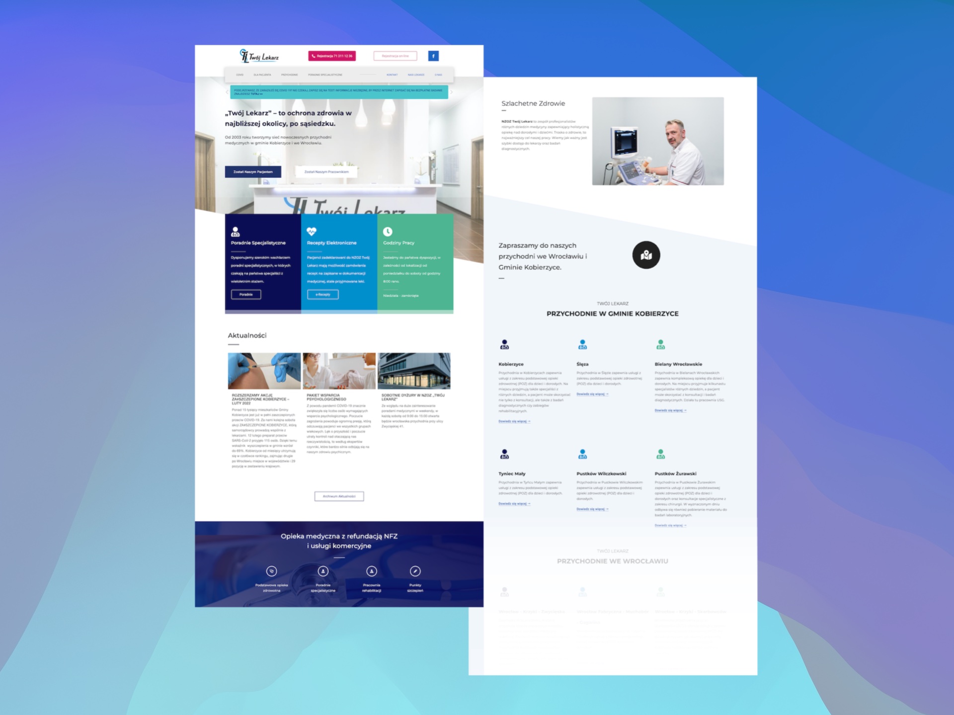
We started developing mockups of the main pages of the website by focusing on the appearance and functionality of the home page. It is the main theme of the entire website and the solutions used on the new home page will determine the shape of the remaining pages. However, before we started designing, we focused on choosing the color scheme.
Choosing the colour palette of the designed website
Proper selection of the colour palette is an important factor in user experience design. According to the theory of color, different colors, like music, can evoke diametrically different feelings among recipients. For example, red is a very warm color. We associate it with fire, violence, but also with love. The color red can induce somatic changes in the human body, such as increased blood pressure, increased breathing rate, and can also increase metabolism. In a word, red is a strong color that arouses a kind of alarm in us.
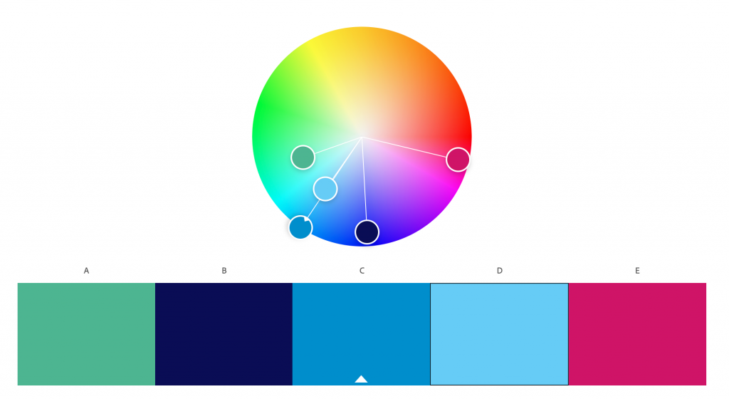
For this reason, you should consciously choose colors for website designs dedicated to specific industries. To generate color palettes, we used tools available in the package Adobe Colors.
Blue, on the other hand, represents calmness, responsibility and professionalism. Light shades of this colour are associated with friendship, and navy blue inspires trust. Blue and its various tones are clearly associated with medics, which is why in the new design of the website of the brand "Twój Lekarz" we have chosen a blue colour palette, also containing branding colours, along with a complementary pink accent, referring to the fact that the website is mainly used by women, which resulted from an audit of the demographics of traffic on the website.
Redesign, i.e. redesigning an existing website
The old site provided a lot of information in popups, which was not the best solution from the point of view of usability of the site, especially on mobile devices. We wanted the new site to be clear and legible and to guarantee trouble-free finding of the content sought. We started designing the appearance of the site by checking the data to find out who uses it and how.
Thanks to the initial audit, we knew that 68% of the site's traffic was generated by women in the 25-44 age segment. We already knew that we were designing an interface primarily for women using smartphones, so the site not only had to look beautiful, but also work well on mobile devices.
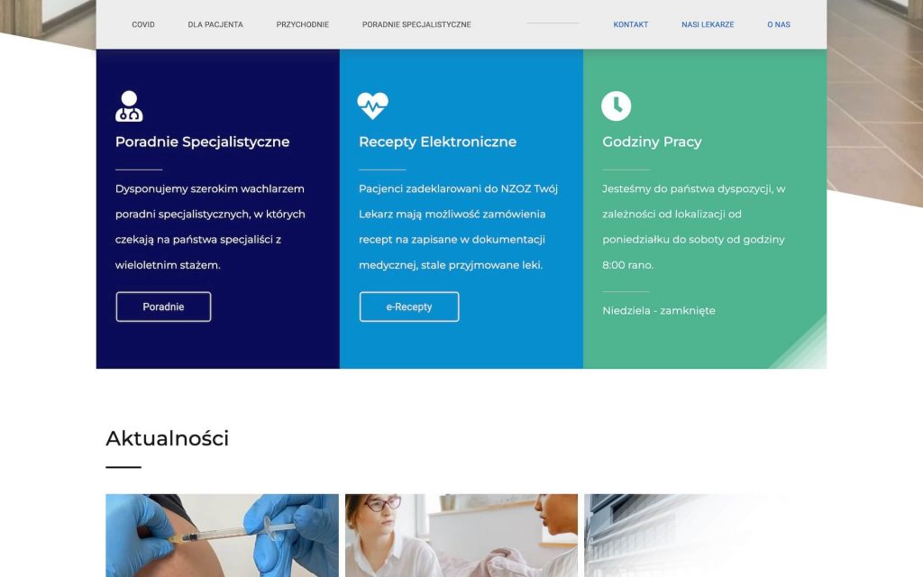
In our design, we decided to use simple, geometric shapes that would not cause surprise among users looking for information.
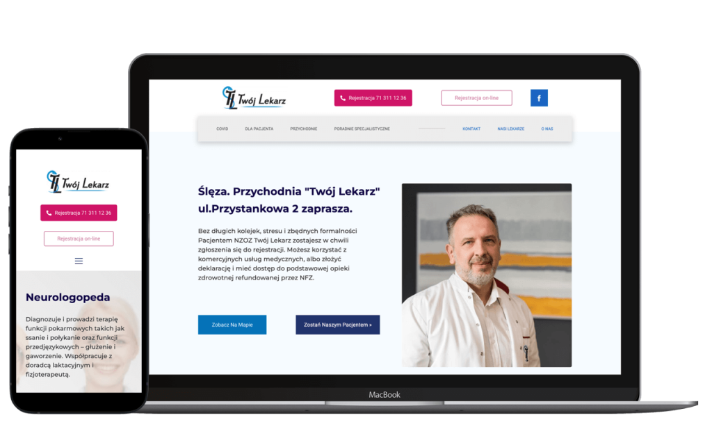
The home page consists of a double menu with drop-down lists in each category, an informational header about the “Your Doctor” brand, and three rectangular containers containing the most important information from the patient’s perspective. The motif of the three containers is repeated on each of the pages and combines both informational and navigational elements.
We proposed a top menu consisting of two clearly separated parts. The top part located near the brand identity, which contains strong CTAs for phone registration and online registration.
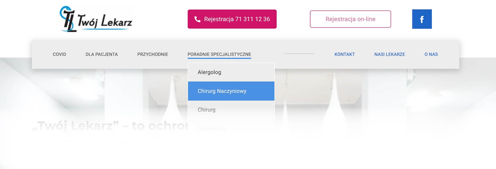
The lower bar is divided into two thematic categories with a drop-down menu. The first section, on the left, is dedicated to the patient, the second section - information and contact.
The old version of the site basically did not have a footer, which is an often underestimated element of communication with the user. Meanwhile, a properly selected footer menu significantly supports user navigation around the site, as well as supports the SEO of the entire site.
Customer communication
During the design process, thanks to the trust our client placed in us, we had a lot of creative freedom. However, we remained in constant contact, consulting on key changes to the project.
The target menu used on the website is the second iteration of our initial proposal, containing modifications that were important from the client’s perspective (as standard, as part of a project quote, the design proposal includes two modification iterations at no additional cost).
Redesigning an existing website is a big challenge. On the one hand, it involves proposing new quality while taking into account the experiences and habits of regular users of the website.
Website redesign – strategic value for the brand
In the described case in particular, the redesign of the website had an additional impact during the successive waves of the COVID19 pandemic. During the lockdowns, patients were able to conveniently access the information they were looking for about clinics, doctors working there and the services they provide.
What's more, during the spikes in traffic on the site caused by the pandemic, patients retained the option of ordering e-prescriptions via a dedicated subpage. Before the redesign, orders were handled via email, which resulted in many unconfirmed messages and regular spam. Handling such email caused many problems, which were solved by linking the order form to a dedicated email address.
This simple system also proved useful during a telephone system failure, providing constant access to the possibility of ordering e-prescriptions for patients in need, and the staff of the Twój Lekarz clinic with efficient management of incoming e-prescription orders. Once again, it was confirmed that it is worth investing in new solutions that support the efficient operation of the organization even by automating part of the process.

Aleksandra Dzwierzyńska
Head of Social
ola@komukoncept.pl

Michal Opydo
Managing Director
michal@komukoncept.pl