Today we’re going to tackle the topic of social media post content. Or more specifically, we’re going to tackle how they look when we post them on social media. Grab your notebooks and let’s get started!
How to write posts for Facebook, Instagram or LinkedIn – let's start with strategy
Or more precisely, from that part of it that is responsible for the style and language of communication. The post must be of some kind. It would be good if it was interesting enough to hold the recipient, to respond to their current needs.
How do we know how to communicate with our fans in our posts? Nothing comes out of thin air – we have to sit down and create communications strategy.
In every communication strategy (the well-prepared one) we will find a definition of the style and language we will use to address the recipient. Without it, we will not know whether we should write to our fans using the “you” or “you” address, whether we should use inclusive language (sam_a, teacher_ka), or whether we can allow ourselves to be relaxed in language (Hi people. Teddy Bears, we have an important topic for you, etc.).
In addition, the strategy will determine a collection of words and phrases, which we can use and which can be an inspiration for further sets. Below is an example of a few phrases that we included in the strategy of one of our clients (gastronomic industry, Italian cuisine restaurant):
- siesta
- mornings
- second coffee
- party
- the smell of coffee
- the sweetness of macaroni candies
- fresh pasta
- aromatic basil
- light and swirling bubbles in prosecco
- Italian street
- a quiet place
- friends
- buongiorno
- Mamma Mia
This is, of course, 1/10 of the words and associations that we included in the strategy.
This set allows you to start creating content and stay alert – so as not to stray from the designated communication path.
Point one is behind us. What's next?
The purpose of a social media post
Goals are different. They should result from: vision > strategy > goals for a given period > schedule.
On the schedule we determine whether the post is typically sales-related, whether it is intended to activate, or whether we want to create a long post on a topic that is important to us and move our community.
Its length will depend on the chosen goal. Sales Posts are usually very short. Engaging posts at the beginning of the content they contain a question or other incentive to play.
Therefore, before you start writing, always define your goal – what ONE action should the person reading the post perform: like, comment, go to the website, share?
And what we choose, let's communicate on the graphic and in the content. And let's adjust its length.
Post length - different on phone, different on desktop
When creating a post, remember that it displays differently on desktops (longer lines, shorter paragraphs) and on phones (shorter lines, longer paragraphs). I always try to “design” content for smartphones, because most of our clients’ texts are absorbed there.
There are specific steps behind this. I use more organizing emoticons and create shorter paragraphs.
Speaking of paragraphs…
Paragraphs and spacing – or give the reader a breather
This rule doesn't always work. I myself read long walls of text from people who have something interesting to tell me. But, let's not kid ourselves. If we run a small fanpage or a fanpage of a brand with a big reputation, we can't afford that. Fans of new brands are not patient enough to read a 150-line post. And followers of big brands can read a wall of text as a lack of professionalism.
That's why we need to give our audience structured content:
- emoticons (but not too much)
- short paragraphs
- spaces between these paragraphs (so let's press ENTER twice :) )
- IN CAPITAL LETTERS
Thanks to these procedures, the recipient will be presented with an organized, easy-to-digest and readable text. They will choose from the post what is most important to them.
Linguistic correctness of posts
Another important topic. Especially for people who run fanpages, where followers won't miss a single spelling mistake, a single misplaced comma ;)
More seriously: correctness of posts in terms of language is welcome, it shows that we have prepared for work, that we did not write the post on the fly. Of course, nobody is perfect. Mistakes happen :) However, double checking the post, reading it aloud before publishing, should reduce the risk :)
Aesthetic social media posts – good examples
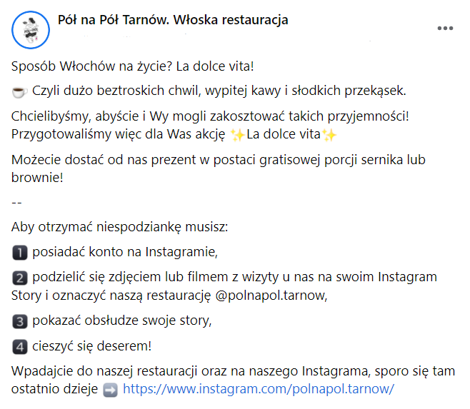
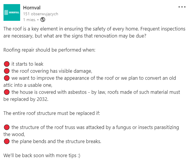
A long (yes, it is a long post) post in which we tried to describe the rules of the promotional campaign. Emoticons, separating content in the middle of the post and short lines helped with this:
An example of short content that was intended to direct viewers to watch a Live broadcast:
And finally, an example of an explanatory post that was organized with one type of emoticon. Notice how the “double enter” organizes the content and creates space between paragraphs, giving the reader a breather:
I hope that from now on your posts will be audience-friendly! If you want to expand your knowledge about social media, I invite you to our other articles:
How is AI changing B2B marketing and why is it worth implementing it with a digital agency?
Until recently, artificial intelligence was a futuristic term known primarily from science fiction books and films. Today, it's already having an impact…
Technological foundation in the medical industry: website as an effective funnel
In the world of B2B marketing – especially in the demanding healthcare industry – purchasing decisions are rarely impulsive; they are often long and…
B2B Marketing Strategy for 2026
2026 will bring a further shift toward relationship-based marketing, experiential marketing, and consistent communication. For B2B companies competing…
- Written by: Ola Dzwierzyńska
- Posted on: 9 Feb 2022
- Tags: Content Marketing, facebook, instagram, LinkedIn


